
Product pages and furniture features
This page explains the product page in Tenora and the features made for furniture, outdoor, lighting and décor stores. For each feature, you'll learn what shoppers see, what data it needs and how to turn it on.
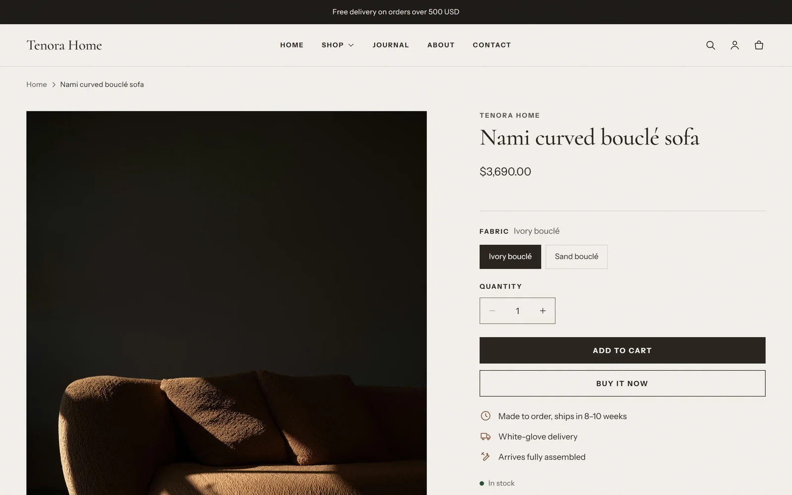
How the product page is built
The product page uses the Product information section. This section is made of blocks. You can add, remove and reorder the blocks in the theme editor.
To edit the product page:
- Go to Online Store → Themes.
- On the Tenora theme card, select Customize.
- At the top of the theme editor, open the page selector and select Products → Default product.
- In the left sidebar, select the Product information section to see its blocks.
The Product information section has these blocks: Vendor, Title, Price, Variant picker, Quantity selector, Buy buttons, Inventory status, SKU, Description, Collapsible tab, Text, Dimensions, Materials and care, Delivery and assembly, Order a sample, Complementary products, Custom Liquid and app blocks. For all block settings, see the Sections and blocks reference.
The default product template already includes the Dimensions, Materials and care, Delivery and assembly and Order a sample blocks. They stay hidden until your products have the data they need.
Blocks hide themselves when data is missing
The furniture blocks read product data from metafields. If a product has no data for a block, the block shows nothing on that product page. There is no empty box and no error.
This means you can:
- keep all the blocks in one product template for every product
- fill in your products little by little
- sell products that don't need these features, such as gift cards, with the same template
To set up the metafields, see Metafields and metaobjects setup.
Dimensions
What shoppers see
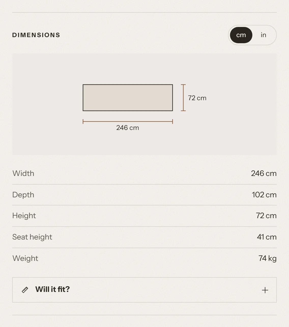
- A table with the product's width, depth, height, seat height and weight. Only the values you filled in are shown.
- A switch between cm and in. Weights switch between kilograms and pounds at the same time.
- An optional front-view drawing of the product with dimension lines for width and height.
The shopper's unit choice is remembered on their device. It also applies to every other product they open. If the browser doesn't allow storage (for example in some private browsing modes), the switch still works on the current page.
What data it needs
| Row | Metafield | Type |
|---|---|---|
| Width | specs.width | Dimension |
| Depth | specs.depth | Dimension |
| Height | specs.height | Dimension |
| Seat height | specs.seat_height | Dimension |
| Weight | specs.weight | Weight |
You can enter lengths in mm, cm, m, in, ft or yd, and weights in g, kg, lb or oz. The theme converts them to centimeters and inches (kilograms and pounds) and rounds them to one decimal place. Use one of these units: a value in any other unit is read as centimeters (or kilograms).
Important: Check your store's unit system before you enter values. For more information, see Metafields and metaobjects setup.
How to turn it on
- Open the product template in the theme editor (Products → Default product).
- In the Product information section, select Add block → Dimensions. Skip this step if the block is already there.
- Set the block settings:
- Heading: the title above the table. Leave it empty to show "Dimensions" in your store's language.
- Default units: Centimeters and kilograms or Inches and pounds. This is the unit shoppers see first. Shoppers can switch units.
- Show dimension drawing: shows the front-view drawing.
- Show fit helper: shows "Will it fit?" under the table.
- Select Save.
The block is hidden when none of the five metafields has a value. The drawing needs both width and height.
Will it fit?
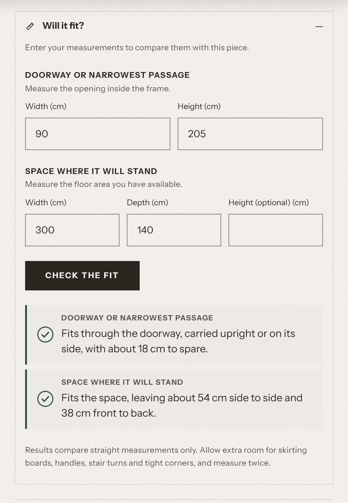
"Will it fit?" is part of the Dimensions block. It opens under the dimensions table when the shopper selects Will it fit?.
What shoppers see
The shopper enters two sets of measurements and selects Check the fit:
- Doorway or narrowest passage: the width and height of the opening inside the door frame.
- Space where it will stand: the width and depth of the floor area, and an optional height.
The shopper can check only the doorway, only the space, or both. If the shopper switches between cm and in, the numbers they typed are converted.
Each result has an icon and a short message:
- A check mark: the piece fits, with the amount of room to spare.
- An exclamation mark: the piece fits, but only just (a tight fit).
- A cross: the piece is too large, with the amount it is too large by.
How results are calculated
The check uses the product's width, depth and height. All calculations happen in the shopper's browser. No data is sent anywhere.
Doorway
- The theme assumes the piece can be carried upright or on its side, but not tilted.
- It compares the two smallest product measurements with the doorway width and height.
- If the piece fits with less than 2 cm (about 0.8 in) to spare, the result is a tight fit.
- If the piece is too large, the message says so and suggests that the shopper contacts you. Some pieces can still be tilted through a door.
Space
- The theme compares the product's width and depth with the width and depth of the space.
- It also tries the piece turned 90 degrees. If the piece only fits when turned, the message says so.
- If the piece fits with less than 5 cm (about 2 in) to spare on a side, the result is a tight fit.
- If the shopper enters a height and the piece is taller, the result says the piece is too tall, even if the floor area is large enough.
The disclaimer
Under the results, shoppers always see this note:
Results compare straight measurements only. Allow extra room for skirting boards, handles, stair turns and tight corners, and measure twice.
The result is a guide, not a promise. We recommend that you also explain your returns policy for items that don't fit.
What data it needs
"Will it fit?" needs all three of specs.width, specs.depth and specs.height. If one of them is missing, the dimensions table is still shown, but "Will it fit?" is hidden.
How to turn it on
In the Dimensions block, turn on Show fit helper. It's on by default.
Materials and care
What shoppers see
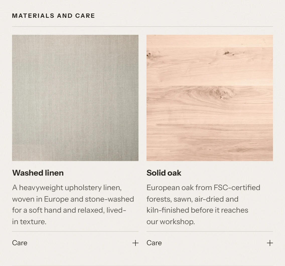
The materials of the product, each with its name, an image, a description and care instructions. You can choose one of two layouts:
- Cards: a card for each material with a large image, the name and the first sentence of the description. The care instructions open with the Care toggle. Materials without an image get a neutral tile, so the cards stay aligned.
- List: a row for each material with a small image and the name. The row opens to show the full description and the care instructions.
What data it needs
- A "Material" metaobject entry for each material, with at least a name. The image, description and care instructions are optional.
- The product metafield
specs.materials, which links the product to one or more materials.
Because materials are metaobjects, you describe each material once and reuse it on many products. If you edit a material, all products that use it are updated.
A material without a name is not shown.
How to turn it on
- In the product template, select Add block → Materials and care. Skip this step if the block is already there.
- Optional: set Heading. Leave it empty to show "Materials and care" in your store's language.
- Set Layout to Cards or List. The default product template uses Cards.
- Select Save.
The block is hidden when the product has no linked materials.
Order a sample
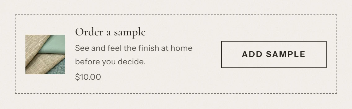
What shoppers see
A small card with an image of the sample, a heading, a short text, the sample price and an Add sample button. The button adds the sample to the cart without leaving the page.
- If the sample costs nothing, the price line shows Free.
- If the sample is sold out, the button shows "Samples currently unavailable" and can't be selected.
What data it needs
A sample is a normal product in your store, for example "Fabric swatch set". Create it like any other product and give it a price (or 0 for a free sample).
The block finds the sample in this order:
- The product metafield
specs.sample_product(a product reference). Use it to give each product its own sample. - The Sample product setting of the block. Use it for one sample that applies to all products.
The block adds the first available variant of the sample product. If the sample has several variants, such as fabric colors, create a separate sample product for each one, or link each furniture product to the matching sample.
The block is hidden when there is no sample product, and on the sample product's own page.
How to turn it on
- In the product template, select Add block → Order a sample. Skip this step if the block is already there.
- Optional: choose a Sample product as a fallback for products without their own sample.
- Edit Heading, Text and Button label if you want to. When they're empty, the card shows "Order a sample", "See and feel the finish at home before you decide." and "Add sample" in your store's language.
- Select Save.
Tip: Samples are real products. Remember to set their stock, shipping weight and whether they are taxable.
Delivery and assembly
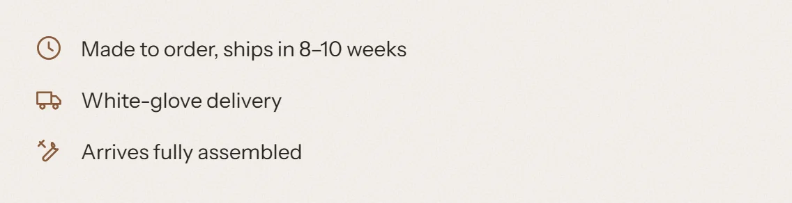
What shoppers see
Up to four lines, each with an icon:
| Line | Icon | Example |
|---|---|---|
| Lead time | Clock | Made to order, ships in 6–8 weeks |
| Delivery method | Truck | White-glove delivery |
| Assembly | Tools | "Some assembly required" or "Arrives fully assembled" |
| Assembly guide | Download | A "Download the assembly guide" link |
What data it needs
| Line | Metafield | Type |
|---|---|---|
| Lead time | delivery.lead_time | Single line text |
| Delivery method | delivery.method | Single line text |
| Assembly | delivery.assembly_required | True or false |
| Assembly guide | delivery.assembly_guide | File |
Only the lines with a value are shown. The assembly line is shown when delivery.assembly_required is set to either true or false. If it's empty, the line is hidden.
The lead time and delivery method are shown exactly as you type them. Write honest, specific text, for example "In stock, ships in 3–5 working days".
How to turn it on
- In the product template, select Add block → Delivery and assembly. Skip this step if the block is already there.
- Optional: add a Heading. By default the block has no heading.
- Select Save.
The block is hidden when none of the four metafields has a value.
Shop the room
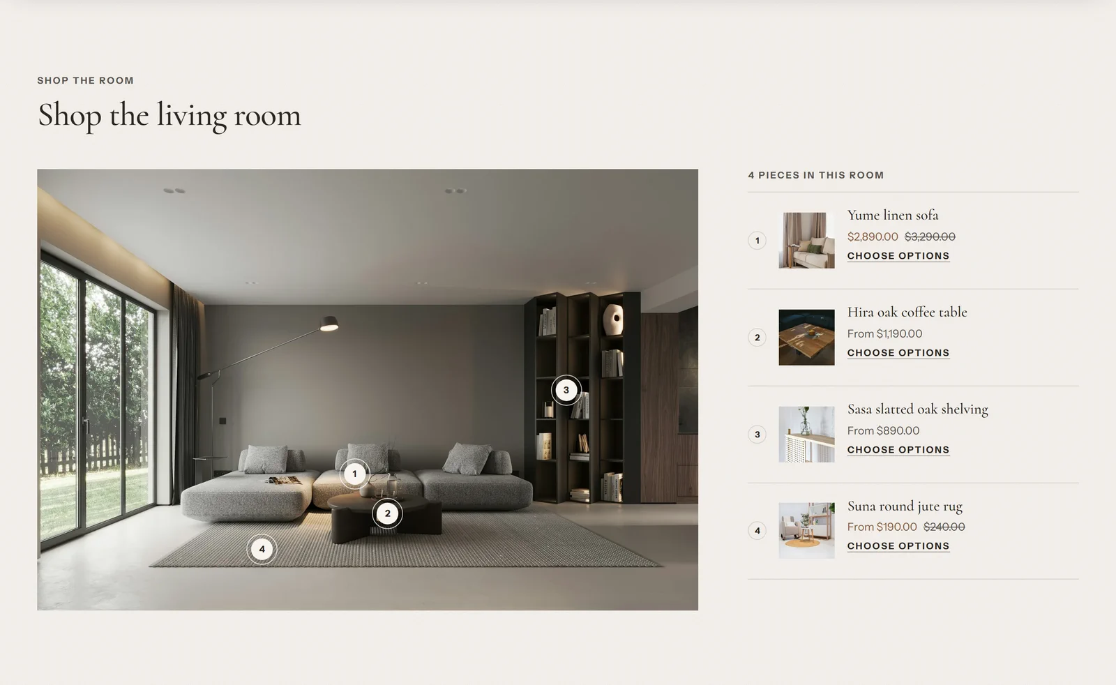
Shop the room is a section, not a product page block. You can add it to the home page or to any other page.
What shoppers see
- A large room photo with up to 8 numbered points (hotspots).
- When a shopper selects a point, a small card opens with the product image, name and price. On large screens the card opens next to the point. On phones it opens from the bottom of the screen.
- Next to the photo (under it on phones), a numbered list of the same products, with a heading such as "4 pieces in this room".
- Products without options have an Add to cart button. Products with options, such as sizes or colors, or with subscriptions, have a Choose options link to the product page.
Shoppers can use the points with a keyboard and with screen readers. Each point is announced with its number and the product name.
What data it needs
- A room image. A 3:2 image is recommended. On phones the image is shown in a 4:3 shape, so keep the important parts away from the edges.
- A product for each hotspot.
This section doesn't use metafields.
How to turn it on
- In the theme editor, open the page where you want the section, for example the home page.
- Select Add section → Shop the room.
- Select Image and upload your room photo.
- Edit Subheading, Heading and Text.
- For each Hotspot block:
- Choose a Product.
- Move the point with Horizontal position and Vertical position (0–100%) until it sits on the product in the photo.
- Select Add block → Hotspot to add more points, up to 8.
- Optional: choose the Product card color scheme for the cards that open from the points.
- Select Save.
Important: Unlike the product page blocks, this section doesn't hide itself. Without an image, it shows a placeholder illustration. A hotspot without a product shows its Label text and a sample price. Choose a product for every hotspot and remove unused hotspots before you publish.
Other product page features
Tenora also supports these standard Shopify features on the product page:
- Variant picker with buttons, color and image swatches, or dropdowns. Values that don't exist with the current selection are crossed out.
- Inventory status with a low stock message. It uses your real inventory only.
- Collapsible tab blocks for extra information, such as a returns policy or a size table. The content can come from the block or from a page.
- Pickup availability, Shop Pay Installments, dynamic checkout buttons, gift card recipient form, subscriptions (selling plans) and quantity rules and volume pricing.
- Complementary products, set up in the Search and Discovery app from Shopify.
- A media gallery with image zoom, videos and 3D models.